What is your brand about? What do you look for when revamping your brand identity with a brand-new logo? This is a strategic choice for businesses to make, but with a great logo consultant at Ultrabyte International, it can be easy.
Today we explore what type of logo resonated more with your brand, a dynamic or simply a wordmark. We also look for signs that our brand voice is raised to the maximum through the creative display of our logo. If you have an existing logo, we also provide redesign services at your convenience to make it up-to-date and as relevant as you like.
Wordmark logos express simplicity, are clean, and use a letter-based format, with the gist of relying more on the brand name and conveying the brand’s personality with the font choice. Logotype or wordmark is all about typography, where one uniquely uses the brand name.
Examples: Coca-Cola, Google, FedEx, YouTube and Visa

These font choices communicate and possibly trick consumers, and that’s where they grab attention. Well-thought-out logo designs work most of the days and align with what values or services the brand sells. These messages could be superiority, a sophisticated sense of class, and nature.
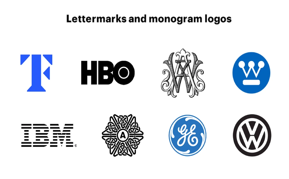
It is a subset of word marks as it is also a typographic logo. This text-based logo uses full words or initials with their font choice, which can even be cursive hand lettering or calligraphy-style typography.
You can find logotypes using online tools like WhatTheFont and browser extensions like Fonts Ninja to buy fonts. There are different types of logos, from monogram letter marks to design experimentation and customization, for which we very well serve.
It has just texts using the initials of the brands. When the brand name is too long, the brand name is abbreviated into single letters. It’s a tough thing in a logo to find a way to make a handful of letters become iconic. The message and typography should be key when marketing such logos.
Examples: HBO, Chanel (CC), Cartoon Network (CN), and CNN. KFC
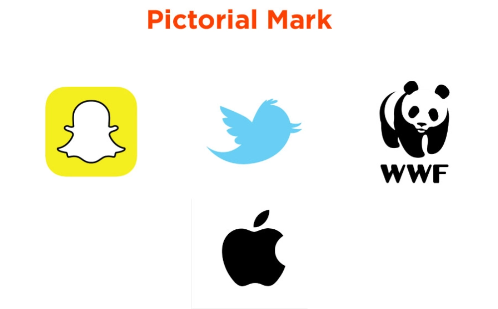
Pictorial marks, or logo symbols, are powerful visual representations of the brand, which is a recognizable images or icons. It includes simplicity and evolution without even the use of the text.
Complex logos can confuse viewers and dilute brand recognition. So the pictorial mark needs to be more of a memorable logo. We need to dive more into the concept part through client briefing, brainstorming, and mind-mapping sessions.
Creative work takes time, so we take guidelines of what clients want to see in his/her logo. The discussion needs to know about everything about the client and the initial message. Looking for a fundamental message helps the brand find its direction and brand.
Examples: Apple, Twitter, Snapchat
Research is the main point here; we pour that into our work. The mood board, the primary design of competitors, gets keywords from the clients as early as possible in the game; all this is time-aligned before starting with the pictorial logo designs.
One needs to be careful about how or when to use ideas, master the minimalistic design, and what the key principles are. Speaks more but designs less; “less is more,” but is it keeping the message and visual language highly, says Satori Graphics.
According to him, when fewer colors are used, the brain processes design more easily, reducing the cognitive load and creating a sense of order (like blue is for trust). In addition, we also use accent colors to highlight key elements of your pictorial logo, if at all.
How to use circles to make a logo even at the beginner level Using grids for Logo. Perfectly geometric and editable. These are a type of pictorial logo that does not have a recognizable image but is formed using abstract geometric shapes. These are custom-made for a brand to express its uniqueness.
Some popular companies using Abstract logo marks include Pepsi, Adidas, Nike, and Airbnb. If they are too abstract, the meaning can be missed, so these shall be in consideration when you strategize a logo for your brand.

Mascot logos are illustrated characters as visual representations of their brand. It can be fictitious or real people. These can be human or animal characters. KFC uses Mascots, Pringles also has mascots and our very own Alpha Octo. This brings an element of fun and engagement with such types of logos.

Combination marks are one of the flexible logo designs where we combine visual and text aspects here. It can be used as a combination stacked differently. It gives the potential meaning of the brand into the marketplace, as Stephan Houraghan mentions in his Brand Master Academy channel.
Examples: Burger King, University logo, Amazon, Nestle
![]()
Emblem logos are crests, badges, and seals used by brands to promote their traditional values. Famous brands with crest logos are Starbucks, Harley-Davidson, and more

They are created in different forms, so this might be they can be created in different forms so that they can easily adapt to different branches or segments. An element of the logo changes depending on the situation of the medium. It has changing colors or imagery that brings elements to life through animation. It tells a story in digital spaces, being more than just static designs.
Examples of the dynamic logo include Nickelodeon, Google, and FedEx.
![]()
If we see successful brands, they have a long history of logo redesign with slight modifications to keep their brand relevant to modern times. And there is no harm until you have your core identity; you can redesign it as necessary to make it your true brand identity.
There are 8 principles of an effective logo for brand strategy, which include being simple, attractive, distinctive, timeless, relevant, memorable, professional, and scalable. There could be several reasons you might be looking for a logo redesign; this may be
Sometimes when a company or enterprise starts to grow, they need to be more inclusive with the customers. If the previous logo failed to serve the purpose regarding the new offerings of the company.
When a company merges or is acquired by another, a logo redesign is necessary for their joint identity. Thereby a logo that symbolizes the union of two in a cohesive identity for the newly formed enterprise.
Design trends are ever-evolving, and sometimes, with time, the essence of your logo fades away. Outdated typography, complexity in design, and failure to tell your brand story are something you can be missing. When logos become outdated in trends, you might need to rejuvenate a look to have more enhancing appeal.
When the previous branding plans don’t go as you planned, then there is this need for rebranding efforts to give a fresh name change and shift in business focus. In that case, logo redesign helps set a different visual identity. Sometimes you might need rebranding to overcome the problem of inconsistency in branding.
Our clients look for more, but we believe with the simpler and minimalistic approach as well we curate the craft of iterative design. In our feedback session with clients, we give more suited color palette suggestions, and we help them paint a logo reflecting more on the core function of their business with a brand strategy that they ought to look at.
You can easily book an appointment with our top Logo designers at Ultrabyte, who simplify your projects with the core identity you look to pass on to your customers. Stay tuned for more updates!